I was thinking about this after my last post. Why not use the blog/news posts to provide updates and tips I've learned while making some pretty big projects.
I mean at worst it will get ignored like most of my other posts, and at best it might give an idea of my thought process, it might help others who are stuck in a similar place, and it could get some kind of feedback for my work.
If you don't want to be bombarded by some WIP art and a bunch of digital art jargon feel free to skip this, you're not missing much.
If you want context for what I'm working on, look at my last post. I don't want to retype the whole thing, but basically:
>I use Linux
>I found out how themes are made
>I draw good
Now that that's out of the way, on with the show!
~~~Table of Contents~~~
(Use Ctrl+F to navigate the post if you want)
~>Updates
~>What's new
~>Tricks Learned
~~~~~~~~~~~~~~~
~~~~Updates~~~~
~~~~~~~~~~~~~~~
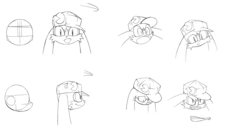
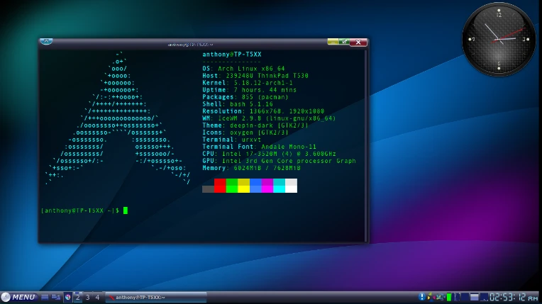
Since my last post I changed the menu button very slightly. I'm talking about unnoticeable to the untrained eye unnoticeable

I basically redid the shading on the orb so that you can actually see the logo when I use the theme (the actual sprite's size is about 25x100 pixels). The reason why I make these sprites so big is because they look really cool at that size, I don't need to work that hard if I want to upscale these sprites, and because pixel-art looks too sharp for what I'm doing (which is a Windows Vista/7 style). [Plus I might reuse some of these sprites elsewhere]
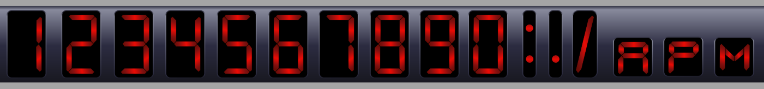
Next, I redid the clock. Last time it was red digits with a black background, now it's just cyan digits with no background.
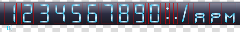
[The red borders aren't there in the actual theme, they're only there to help with making the sprites]
The reason for the change was again because it was hard to see the numbers when the theme was in use (this time it was 12x20 pixels), and the black background the old digits had also made it look unfinished because you couldn't see the borders around the numbers.
~~~~~~~~~~~~~~~~~
~~~~What's New~~~~
~~~~~~~~~~~~~~~~~
Since the last post I've made a couple new things for the theme, they're all unfinished and untested, so they're going to probably change a lot.
First-off I've made the "Show desktop" and "Window List" buttons

They're still kinda rough, and I've put them on hold for now to focus on other sprites.
For those wondering: most of the looks you can give Linux have the "Show Desktop" button on the left side next to the start menu instead of the far right like on Windows; bit annoying to get used to, and I can't change it with the look I'm currently rocking.
The "Window list" button is kinda self explanatory: it basically lists all the windows you have open in a pop-up menu. It's kind of like a slower Alt+Tab (which is also a thing on Linux). I just did it because it was an option I might use.
Now for the good stuff!
I decided to work on the Window borders recently.
It's still not quite done, I still need to finish this one and make like 7 more variations for each state these buttons can be in. My goal with this project is to make a theme that's reminiscent of Windows Vista/7 without being an exact copy of a Windows Vista/7 theme. So I took little things I liked from each OS and made my own. Like the colours of the buttons are the same colours Mac OS uses, the shape and feel is supposed to be reminiscent of something you'd see on Windows, and some symbols that are being used are from Linux.
~~~~~~~~~~~~~~~~~~
~~~Tricks Learned~~~
~~~~~~~~~~~~~~~~~~
Working with something like this is surprisingly tough. Most of the challenge comes from making something that looks good while tiny, that it fits the aesthetic I'm going for, and that works within the limits of the theme. Which made me realize that I should probably look a my work from a distance more often instead of looking at it from my chair.
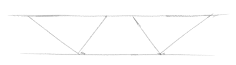
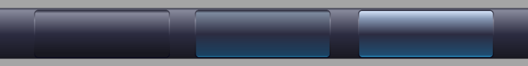
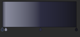
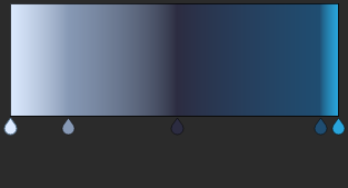
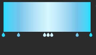
Most of these desktop assets I've made for this theme are done using vectors with gradients. Which is a bit surprising, but it makes sense if you want something that you can stretch horizontally for an infinite amount, and is easy to scale. For example here's the gradient and the colours I used for the taskbar:
One of the taskbar buttons:
And the clock segments:
Where it really became an issue was with the Window borders. Gradients in Krita only go in a straight line, so it makes it really hard to "curve" these gradients for the corners. One solution I had was to use the airbrush tool to do the corners, but colour matching all of it was a big pain in the ass and it didn't even look good.
After a while of tinkering with the airbrush I noticed that I only really needed to darken the edges with the airbrush, and everything else could stay the same and still look good. After realizing that I remembered that Krita has a thing called "Styles" that you can apply to layers as a way to add a little bit of flair like gradients, glowy effects, and shadows to that specific layer. One of these styles called "inner glow" outlines the whole layer and adds a little gradient inside the drawing like so:
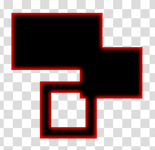
[Black shapes with a red inner glow added to them]
And so what I did was I took the entire window border layer and added this glow effect around it which made it pop-out exactly the way I wanted.
Before:
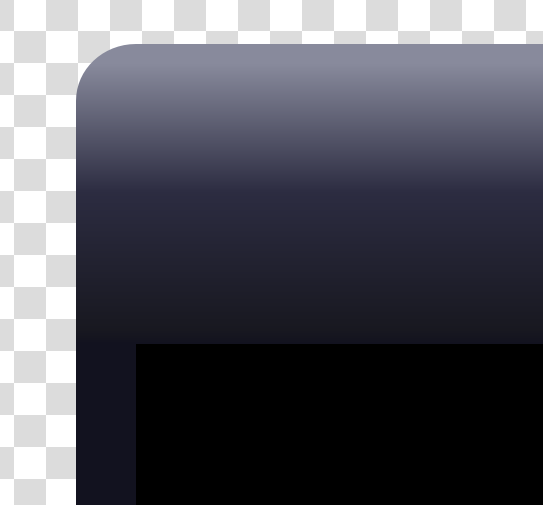
After:
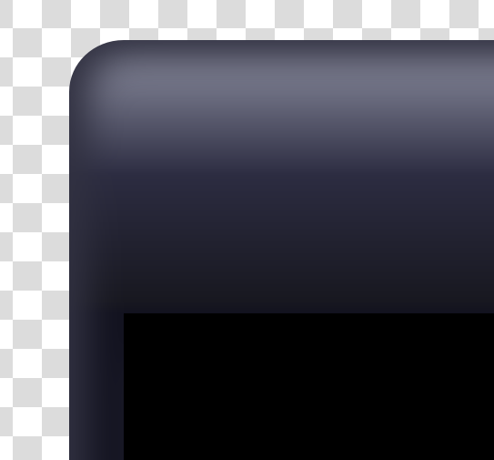
Amazing what a little gradient can do sometime! The little inner corners between the top and sides are a little iffy looking, but that's the best I can do, and even then this will be so small that no one will even notice.
Well better end this post before I either stay up too late or make it way too long to read.
Hope that the 5 people who read the whole thing at least learned something.
...I'm going to bed now.